Tuesday, July 28, 2015

Top Trends In Social Media: Engagement Matters

As social media gains more prominence as a marketing and sales platform, marketers are constantly looking for that edge that will let their messaging cut through the clutter.  Fortune Magazine did a great job in December of last year of tagging the top trends in social media for the year and I couldn't agree more.
  1. Staying relevant on Facebook will cost companies more
  2. More tools to see if Tweets actually produce sales
  3. Social networks will dive deeper into ecommerce
  4. Customer service: Social media and phones work in tandem
  5. The biggest social media innovations will come through the back door
As software like Hootsuite, TweetDeck, Buffer and other social media tools make tracking ROI in the social space easier; companies will gradually feel more empowered to spend money in this space.   From a personal perspective I find that the underlying factor in all of these trends is the ability to get your audience to interact with your content. 

Likes and follow are great, but its how you use your space in their respective feeds that will ultimately determine the rate at which your audience grows.  As people share and interact with your content it raises its profile, and ultimately brand awareness and we all know where that leads. 


Monday, July 13, 2015

3 Rules Of Thumb For Effective Graphic Design

When designing visual elements for marketing use, it is important to understand and apply some underlying theories to the elements you’re designing.  I have recently read a few books that will help you understand some of the conceptual underpinnings behind design. If you are a good artist, then you will learn a lot about theory, if you are not so good with design, then you will learn some good rules to help you take your deign game to the next level.  They books are:


·         -Understanding Comics: The invisible art, Steve McCloud

·         -Visual Thinking For Design, Colin Ware


From each of these books, I was able to learn three major concepts which I have begun to apply to my work.  Aside from the obvious choices such as color, icons, and other static elements one should consider these three rules of thumb:

Ware’s concept of “spatial relationships"
Space is important in layout. Space can be created by content – such as text, images, lists, logos etc. – or it can be created by the space in–between content, called negative space, or whitespace. Space can be passive; a by–product of the layout process. Or, it can be active; there for a reason, to guide the user's eye, or help them make a decision.


Example of Elements Using Spatial relationships to Achieve an Effect


McCloud’s concept of elemental relationships.
Each element in a given image should relate in some way to all other elements involved in the design.

Runco’s idea of “relativity,”
In order to make visual elements understandable they must be made relative to something, i.e. a legend on a map etc. 


Applying these rules of thumb will take you a long way into beginning to think more deeply about what elements to use when creating visual elements and how to display them in a way that appeals to users cognitive minds. 


References:


Runco, M. A. (2014). Creativity: Theories and Themes: Research, Development, and Practice (Kindle). Retrieved at Amazon.com

McCloud, S. (1994). Understanding comics: The invisible art. New York: HarperPerennial.

Ware, C. (2008). Visual thinking for design. Massachusetts: Morgan Kaufmann Publishers. 


Monday, June 29, 2015

Applying Semantics To Image Design: Make Graphics Speak Louder


It is no secret that our brains are hard wired to perceive meaning images. In Visual Thinking For Design by Ware, he discusses what he calls the "color processing machinery," of the eye and which provides a good basis for this hard wiring. The fact that we are so tuned in to the meaning in different colors, designs and shapes provides the basis for the broader application of semiotics, (Ware, 2008).

Building on this; Ware talks about how when image creators properly apply theories of color, spacing, segmentation, emphasis, etc. that Ware (2008) discusses – can have a profound effect on the success of the message conveyed within the images.  These “semantics” – are what drives the connection between the images and what they are meant to convey, and must be considered carefully when curating images - especially for marketing purposes. 
 
Sample Google Heat Map
I also found Ware’s discussion of eye-movement to be very interesting.  In my marketing day-today we often use heat-maps that Google provides that tell us where people eyes are looking and what they are clicking on – which we then use to maximize web-design.  

When Ware was talking about how are eyes are sensitive to movement, shapes and designs – it reminded me of an example one of my teachers in college showed me of an excellent us of semantics and semiotics in logo design.   

When we look at the two Fedex logos do we see a space between the “E,” and “X,” or do we see an arrow or a home?  And if we do what does it infer?  


Ware's book is a great resource for where to begin to segment the process of applying psychology to design.  


References:
Ware, C. (2008). Visual thinking for design. Massachusetts: Morgan Kaufmann Publishers. 

Wednesday, June 17, 2015

Should PowerPoint Stay The Gold Standard For Presentations?


I have used power point religiously – so as I read Has The Goon Squad Come For Power Point I was struck by the idea that while PPT can help add structure, it can take away from the natural “connectivity,” of the information being represented.  However, I have always seen PPT as a supplement to a speech, presentations and the like.

Tufte (2006) discusses how the cognitive style of PowerPoint like the ease of the use of bullet points and other info-condensing styles often “dilute,” the info being presented;  “By leaving out the narrative between the points, the bullet outline ignores and conceals the causal assumptions and analytic structure of the reasoning,” Tufte, 2006). 

Tufte’s example of how data like cancer survivor rates can often loses its power to convey necessary information within PPT because the style of PPT makes them hard to understand because they lack contextual information.  


While looking at some of the examples on the Duarte site – I found the presentation guidelines for ESPN to be very relate-able to this discussion.  I think the presentation, in providing a legend of sorts, is able to give the preceding presentation more relevance and context.  So it seems I don’t have to stop using PPT but my take-away from this week’s discussion is 
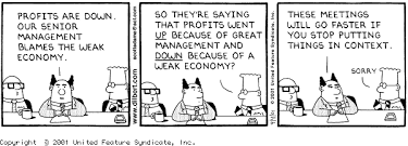
that visuals can be ineffective without context!

Here is an an example of a PPT that deploys some good contextual elements that help provide context for the information to follow in the rest of the presentation.   In my current consulting job we work with overseas partners and the we have to make extra efforts to provide contextual information so we can help understanding accross culutural boundires.  

The brass tacks: PPT is an excellent tool if you supplement it with good context within the presentation themselves and with an accompanying speech can be very useful. 

References:

Behind the Screens. (n.d.). Retrieved June 16, 2015, from http://www.duarte.com/portfolio/behind-the-screens/

Tufte, E. R. (2006). Beautiful evidence. New York.

Has the Goon Squad Come For PowerPoint? (n.d.). Retrieved June 12, 2015, from
http://www.duarte.com/blog/has-the-goon-squad-come-for-powerpoint/

Tuesday, June 9, 2015

What Moves You To Click: A User Poll

What Moves You To Click?

We all have different triggers when it comes to why we click on something online.  I have personally clicked on ads solely on the basis of seeing someone have some comical injury imposed upon them while shilling a brand.  I have a question to all those out there that "click."

Why do you click?

Anyone reading this can you comment with at least one thing that makes you click on an ad, news story, blog post, picture, etc.


Monday, June 1, 2015

The Power Of Context: Making Marketing More Effectual


 Putting things in context is important


In the Power of Inforgraphics, (2012), Smickilas talks about how we have used “icons, graphics and pictures,” to tell stories throughout history. Smickilas is clear that there is a distinct link between design, information and learning. However, as the world becomes a more complex place so does the information needed to interpret the world around us.  Looking at the pictures of the gulls with plastic inside them is a powerful way to communicate the destruction we as humans are doing to the environment.  

Tufte does a great job explain how there are ways in which we display information to better test it’s relativity, i.e. its relationship to other factors by which it can be measured.  Tufte discusses how we can better use new ways to display information where context is provided along with the information in an effort to better explain its relevance (Tufte, 2006).  Tufte also talks about how when we can relate to the information on more than one level - the ability for the data to relay information increases.  

In Jordan’s TED talk - his use of pictures and visual-metaphors to display data feels dated.  However, it is in-line with the idea that news ways of displaying data can invoke emotion and get us to better connect with the information.  In marketing this is not lost on us who ply the trade - but it is an important concept for us to keep in mind as we shift away from text being the chief context provider. 


References:

Tufte, E. R. (2006). Beautiful evidence. New York.

 Jordan, C. (2008, Feb). Turning powerful stats into art. Retrieved from http://www.ted.com/talks/chris_jordan_pictures_some_shocking_stats

 Jordan, C. (2011). Midway Island Trailer. Retrieved from http://www.chrisjordan.com/gallery/midway/#CF000313%2018x24

Smiciklas, M. (2012). The power of infographics: Using pictures to communicate and connect with your audience. Indianapolis, Ind.: Que Pub.

Wednesday, May 27, 2015

Perception & Attention: How The Presentation of Information Matters


It’s no secret that data and information alone – when presented can lose their ability to communicate meaning without associated visual cues, graphics, context or visual appeal.  McCandless (2010) does a good job of illuminating how putting information into context or juxtaposed with relevant data - can have a deep impact creating a “landscape,” by which information can be better enhanced.  

Runco (2014) talks about hoe perception and attention are linked in a way where one can directly affect the other.  When we apply more attention to something our perception and understanding of it goes up – so the better something gets our attention the more likely it is that we will perceive the message being sent.  


Information is power- and the way in which we present that information can help the information be absorbed and understood at a higher and deeper level.  Looking at the radiation exposure chart is just another example of how information is generally “relative,” to other information.  

References:

Eysenck, M. W., Keane, M.T. (2010). Cognitive psychology: A student's handbook. Taylor & Francis.

McCandless, D. (2010, July). The beauty of data visualization. Retrieved from http://www.ted.com/talks/david_mccandless_the_beauty_of_data_visualization?language=en

Runco, M. A. (2014). Creativity: Theories and Themes: Research, Development, and Practice (Kindle). Retrieved at Amazon.com